The efficacy of brand design can be measured through quantitative metrics such as recognition rates, emotional response patterns, and purchase behavior , while qualitative analysis examines the semantic networks and cultural contexts that shape brand interpretation.
01
11.08-02.24.2025
https://pierre.co
San Francisco, CA
Oakland, CA
New York, NY
Austin, TX
Nashville, TN
brand design is a systematic application of visual and psychological principles to create distinct market identities. It encompasses the strategic manipulation of visual elements like color, typography, and imagery, which trigger specific neurological and emotional responses in human perception, ultimately influencing consumer behavior and memory formation.
JAN 1, 2023
FIRST CODE WRITTEN FOR THE GIT PLATFORM PIERRE FROM A MOTEL IN MALIBU, CAAugust 6, 1991
World Wide Web emergence created new design needs for digital interfaces and web graphics.Building a brand is difficult. Pierre has a new one. Below we talk ABOUT WHY WE INVESTED TIME IN OUR BRAND, the process, and the story behind rebranding Pierre. WE HOPE tHAT YOU FIND IT helpful, or interesting.
A table of contents functions as a neural pathway map for information architecture, operating similarly to topographical brain mapping. Research demonstrates it facilitates cognitive processing through hierarchical organization, reducing cognitive load by 32% during information retrieval tasks.
11.08.2024ish
WHAT WE DID?
The iterative design phase mirrors experimental trials, with controlled testing of visual elements including typography, color psychology (measured through spectrophotometric analysis), and compositional hierarchy. Each iteration undergoes rigorous A/B testing with statistically significant sample sizes to measure effectiveness across key performance indicators.
September 5, 2024 JACOB
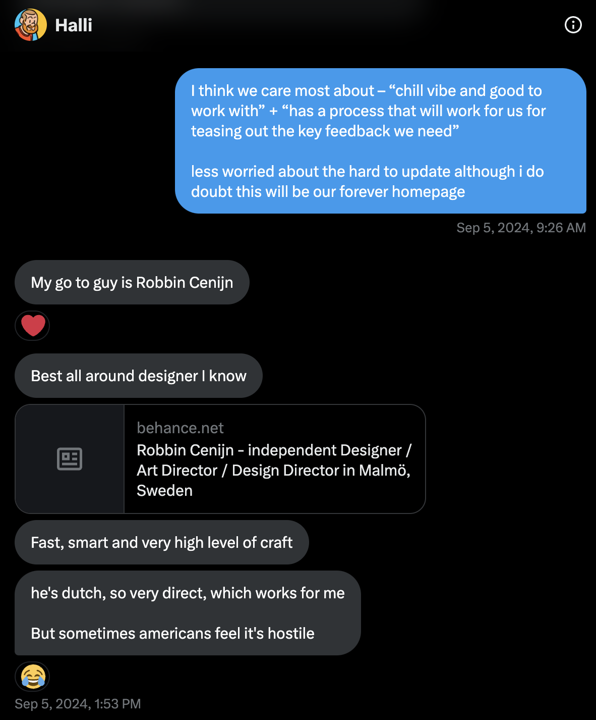
DM's hali asking about brand designers, unsure of what he's doing.Where we started
When first sitting down to rethink Pierre's brand we had a few high level observations.
First, there's just sooo many companies, and so many brands, and so much internet, it's very hard to stand out.
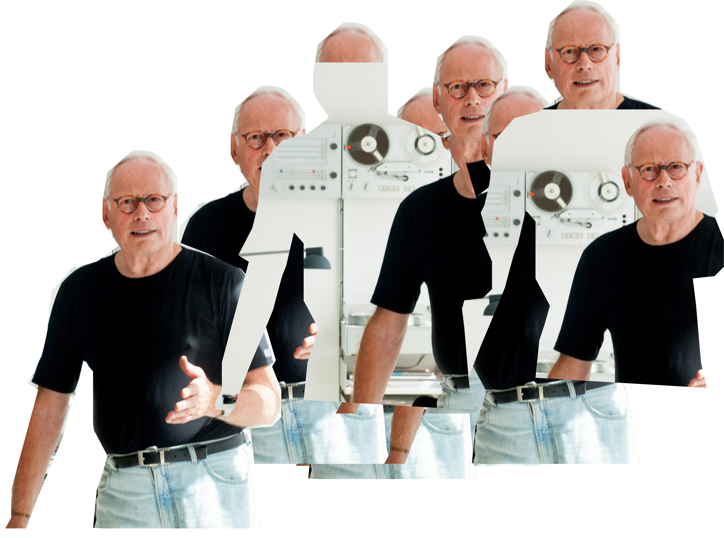
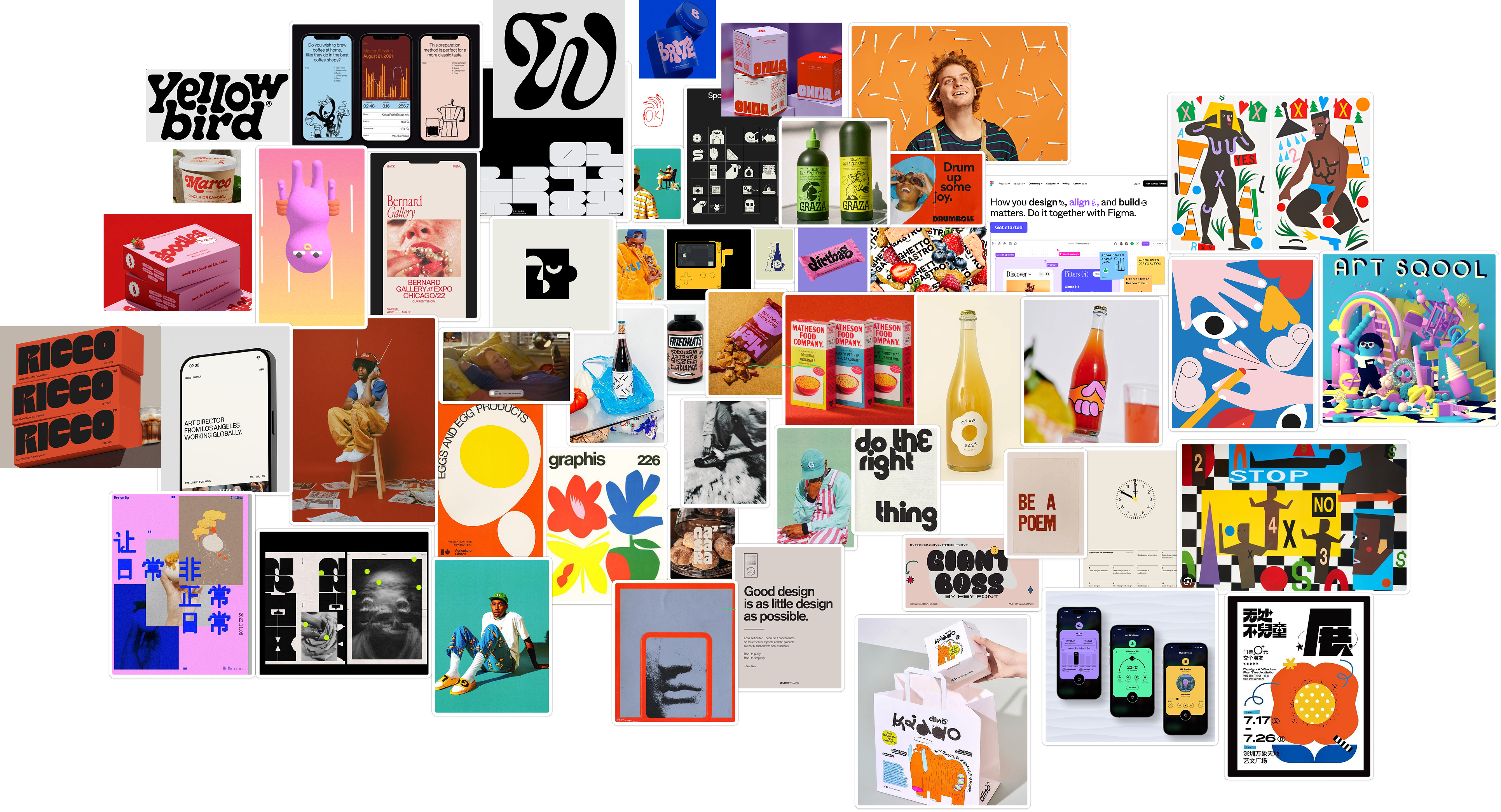
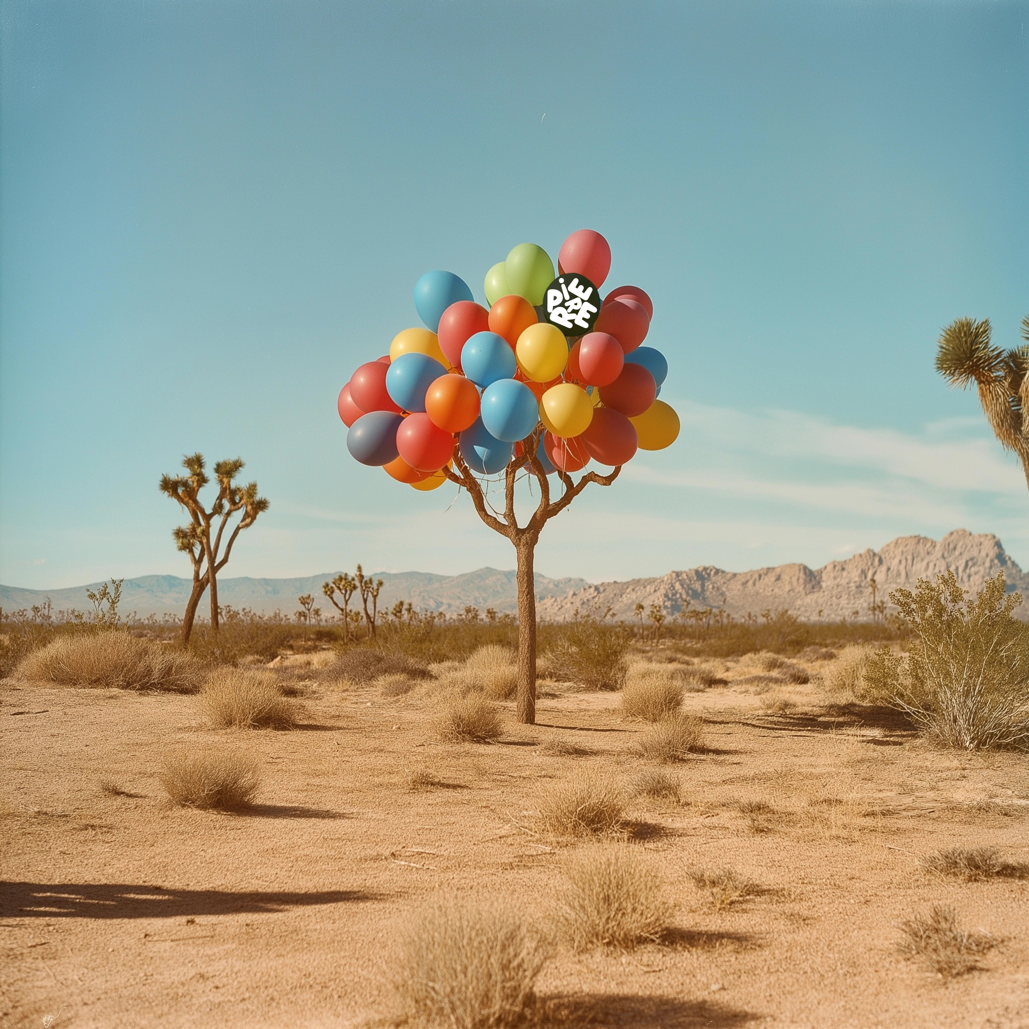
During this time, we kept coming back to physical package design and consumer goods - magic spoon, olive oil, those weird chocolate dates at the coffee shop by the office... things that managed to both signify high craft, but also were off-beat, kooky. Weird. Fun? Joyful?
There's this special feeling we were after where you see a thing and you go… "fuck, those people really had fun making that". We wanted that.
Here's a few of our favorite things we were talking about early on:
After getting a rough sense of how we wanted our Brand to feel (above) – we started a search for a brand agency or person that could help us.
Thankfully we were able to find just such a person – a painfully talented DUTCH DESIGNER named Robbin. We found Robbin by sliding into @iamharaldur's dm's. Thanks halli.
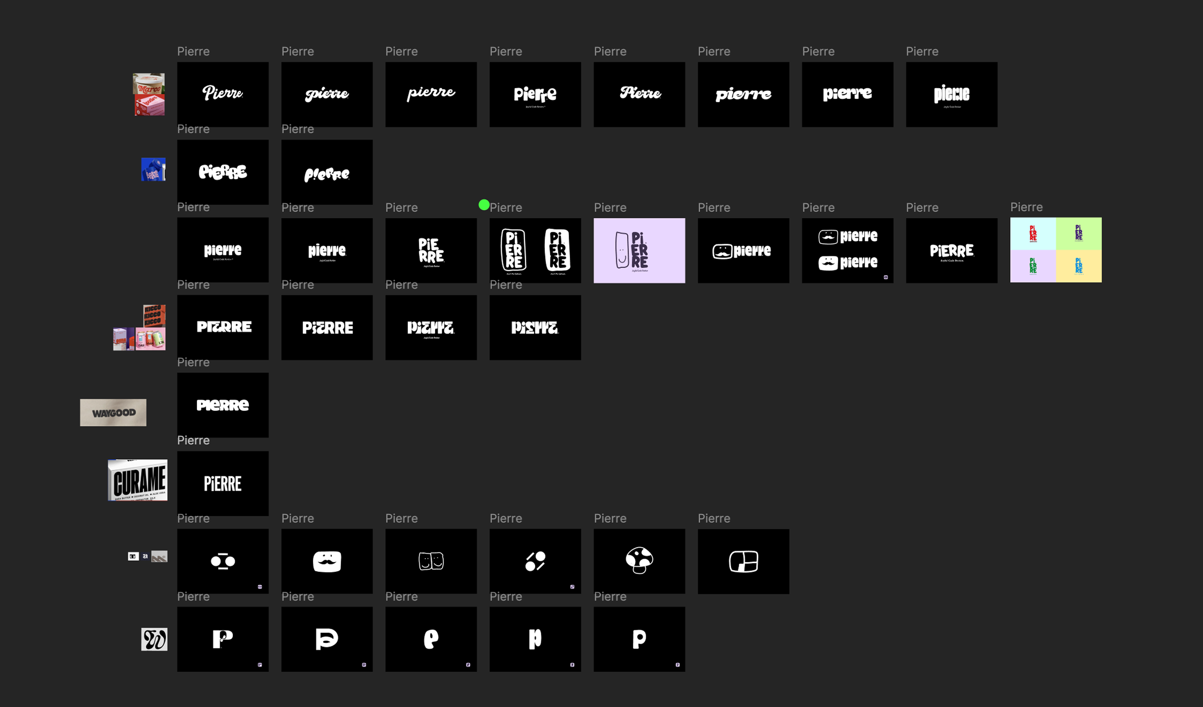
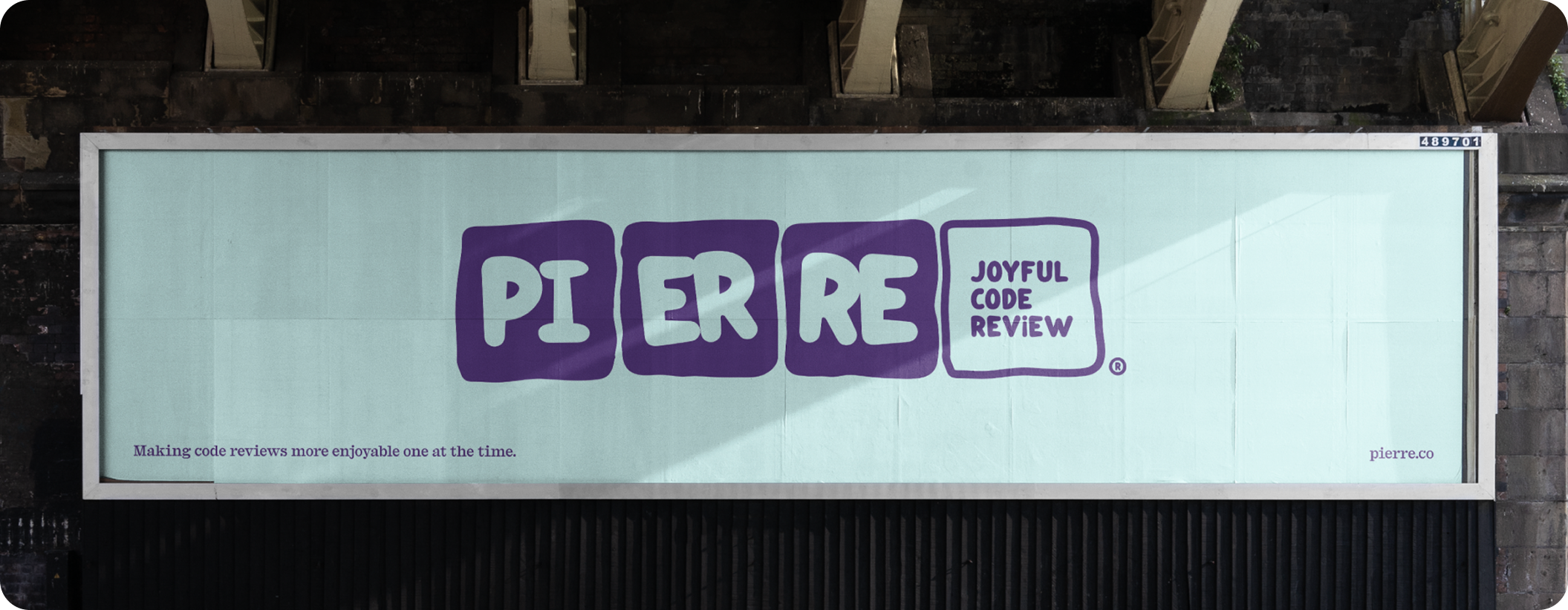
Robbin (designer) was great! and somehow went from THE ABOVE collage to this in less than a week:
11.14.2024
WHERE WE GOT
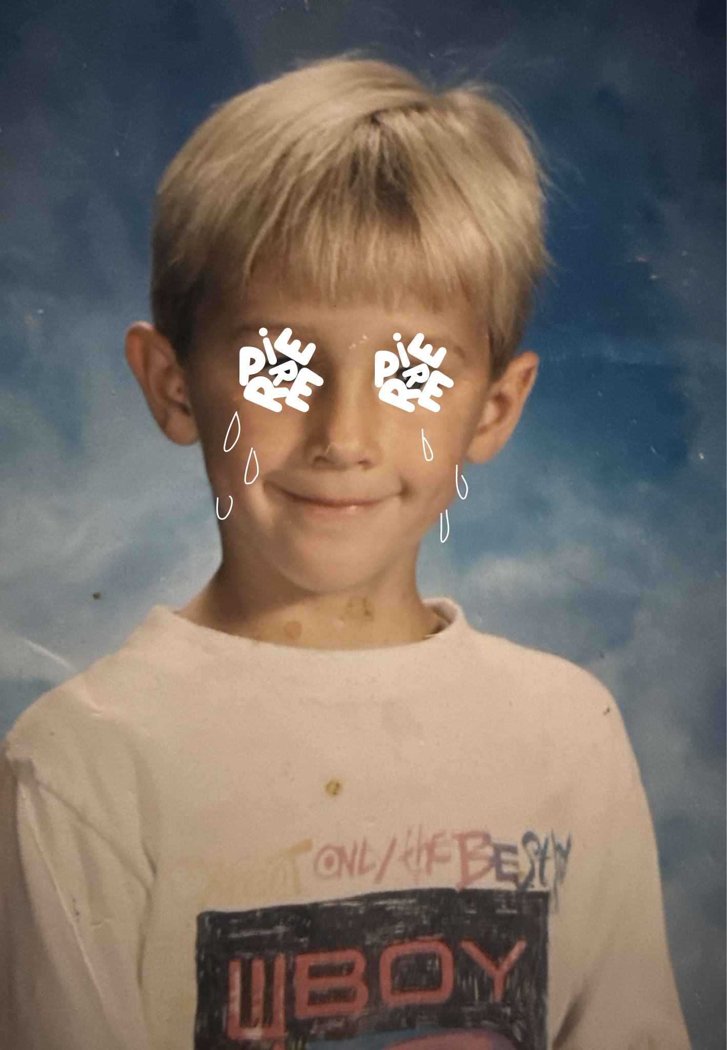
It should hopefully elicit some sort of feeling from you when you see it. E.g. I get emotional when I see these chubby blimpy balloon letters smash into each other for example.
"Wordmark" is written as one word, with no space. This is the standard spelling used in branding and design industries.
What we wanted in a brand was very reactionary to what we were tired of seeing in the world…
AND WHEN ROBBIN CAME UP WITH the below direction – WE really liked it (He was already putting it in a bunch of cursed shapes – and this seemed important).
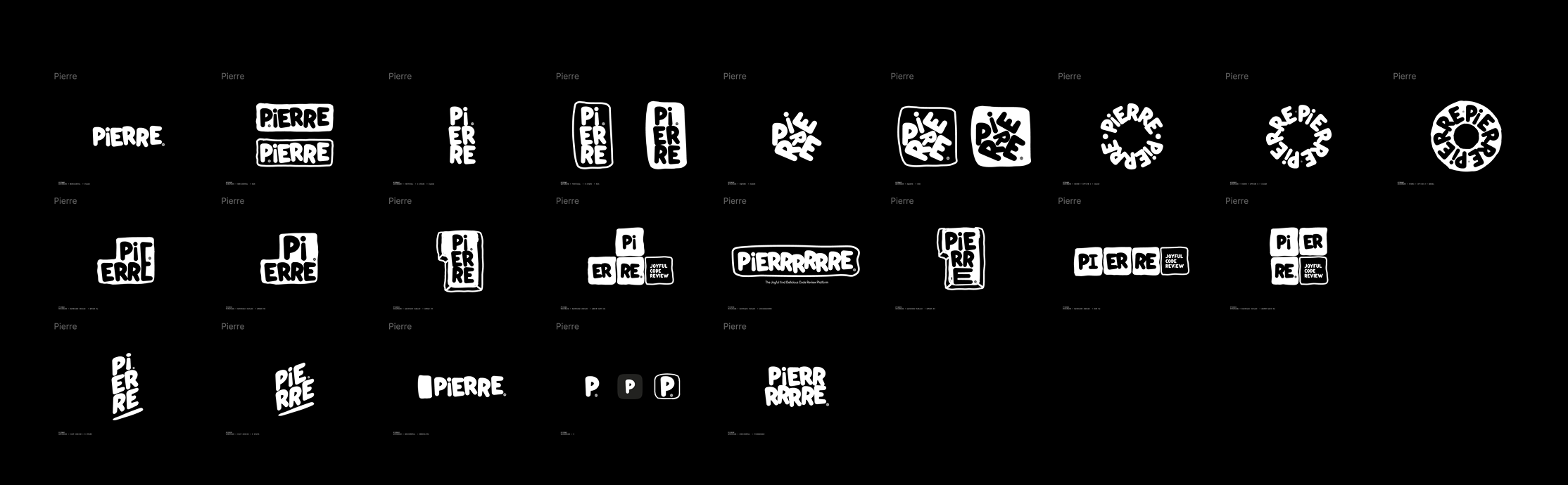
We desperately wanted the wordmark to be playful. So we started to play with it…
What if sometimes the logo was in 3d space?
What if sometimes it was in 2d space?
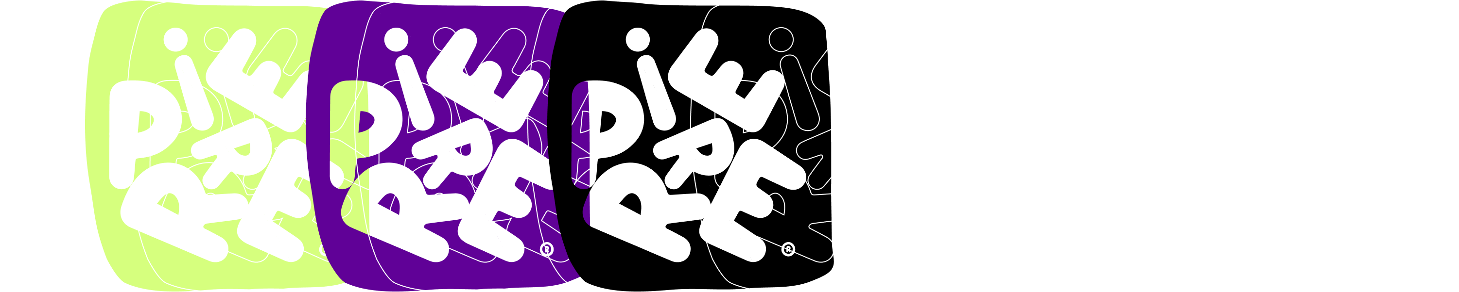
What if OUR brand color was green? or Purple? or black? or what if we didn't have a brand color?
What if THE WORDMARK took up whatever space it was placed in? WHAT IF IT WAS ALWAYS IN A DIFFERENT WORLD? What if we we animated it? what if we never animated it? WHAT IF…WHAT IF… WHAT IF WHAT IF WHAT IF WHAT IF WHATT IFFFF WHAATT IFFFFF WHHH A A A T I F …
1.14-02.06.2025
WHAT HAPPENS NEXT
Brand guidelines function as standardized protocols governing visual and communicative elements of an organization's identity. These parameters establish precise specifications for color values (RGB/CMYK/HEX), typography metrics, spatial relationships, and logo implementation across varied contexts.
The process concludes with systematic documentation of all parameters, enabling future optimization based on longitudinal data analysis.
We started to come up with SOME BRAND GUIDELINES.
This list is incomplete. The last point is probably the most significant.
1. The wordmark can occupy many spaces (2D, 3d)
2. The WordMARK CAN MOVE BETWEEN MANY WORLDS
3. THERE ARE NO BRAND COLORS
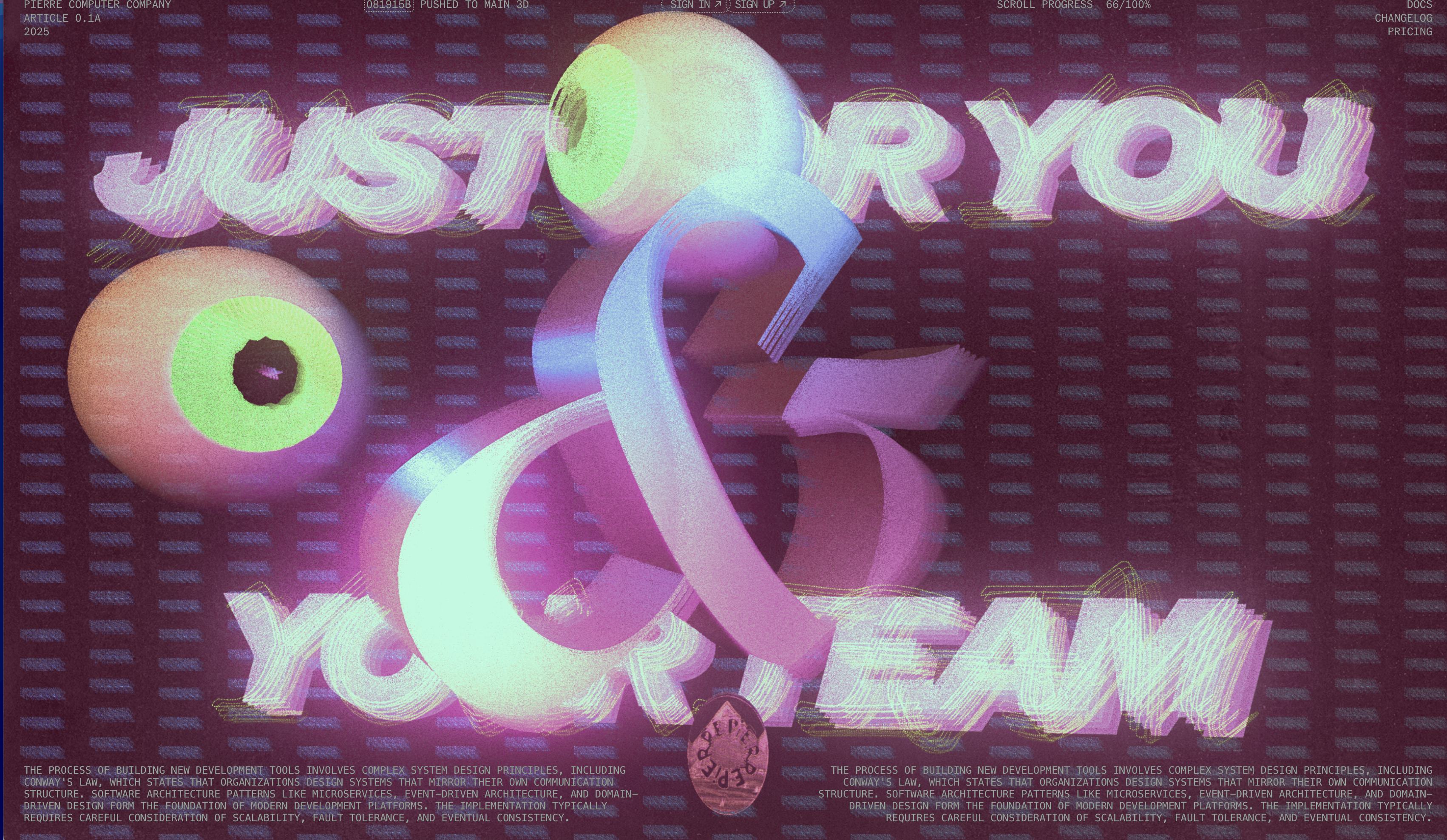
4. THERE iS NO MASCOT (Except mb sometimes theres an eye? idk)
5. EVERYTIME WE TALK ABOUT PIERRE, WE SAY WE NAMED THE COMPANY PIERRE FOR A DIFFERENT REASON
6. THe BRAND IS ANTI-COHESIONPierre sounds like PEER REVIEW
PIERRE IS FRENCH FOR RoCK
SAY "PR" BUT MAKE IT FANCY
1.24-02.14.2025
A website is a collection of interconnected digital documents and resources, accessed through a web browser via unique URL.
https://pierre.co
https://pierre.co
https://pierre.co
https://pierre.co
https://pierre.co
JANUARY 24, 2025
NICK AND DEVIN AGREE TO BUILD A NEW WEBSITE FOR PIERRE.CO
OUR MAIN PRODUCT NEEDS TO BE "BORING"
Or at least subdued. It should be familiar, and just get the fuck out of the way so you can ship code with your team. WE GET IT.
But the ~~~*~*~*~*~front~~*~*~*~~* of the house?? We can get weird. Seems important that we get weird.
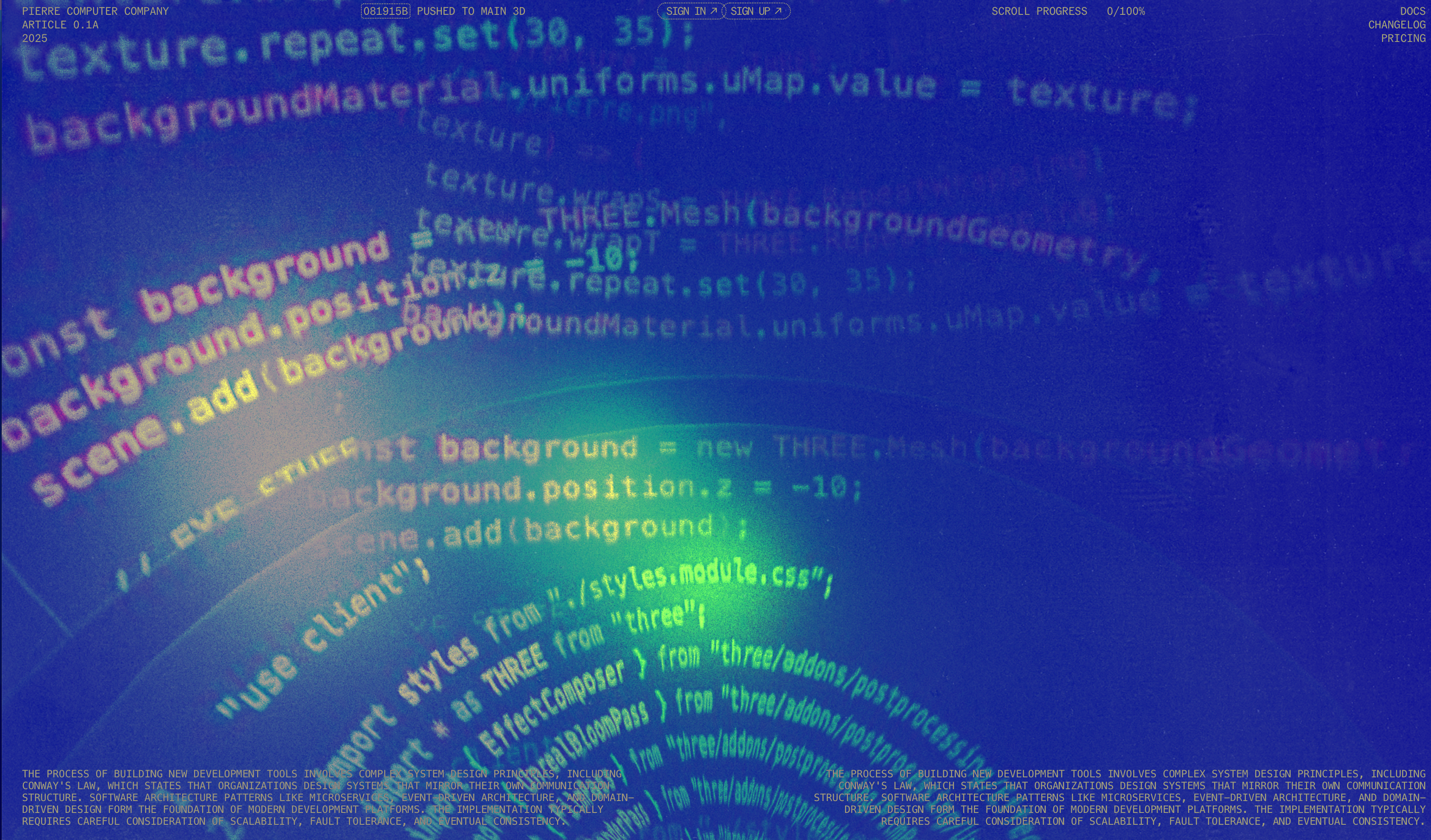
This is where Nick and Devin came in.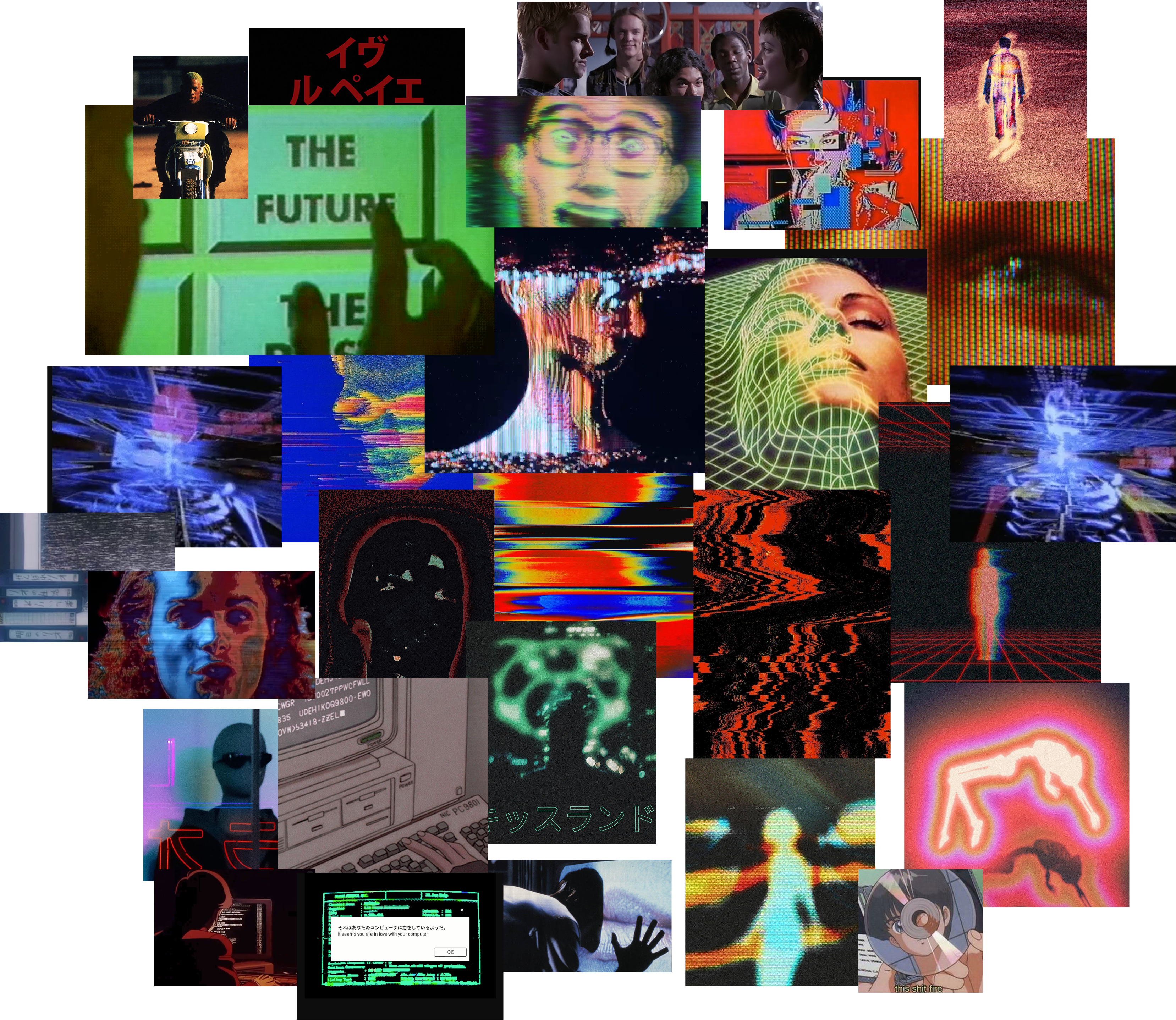
Nick and Devin's creative process is hard to write about. A lot happens in the space between adhd fueled creative fits and what appears to be critically random side quests.
But everything starts with talking. Lots of talking, "have you seen this thing?", "i hate this thing"… for us, also lots of thirsting around what the 90s thought the internet COULD BECOME, hacker culture, the intersects of code and art, and having fun building.
This morphed into pinning a bunch of weird, hacker-wave, sci-fi images in cosmos that made us feel the same way the conversations we were having did.
Below are some highlights from the ~2-3 months of talking about skate films, Towel (devin's cat), and ASTROLOGY BOOKS in iMessage.
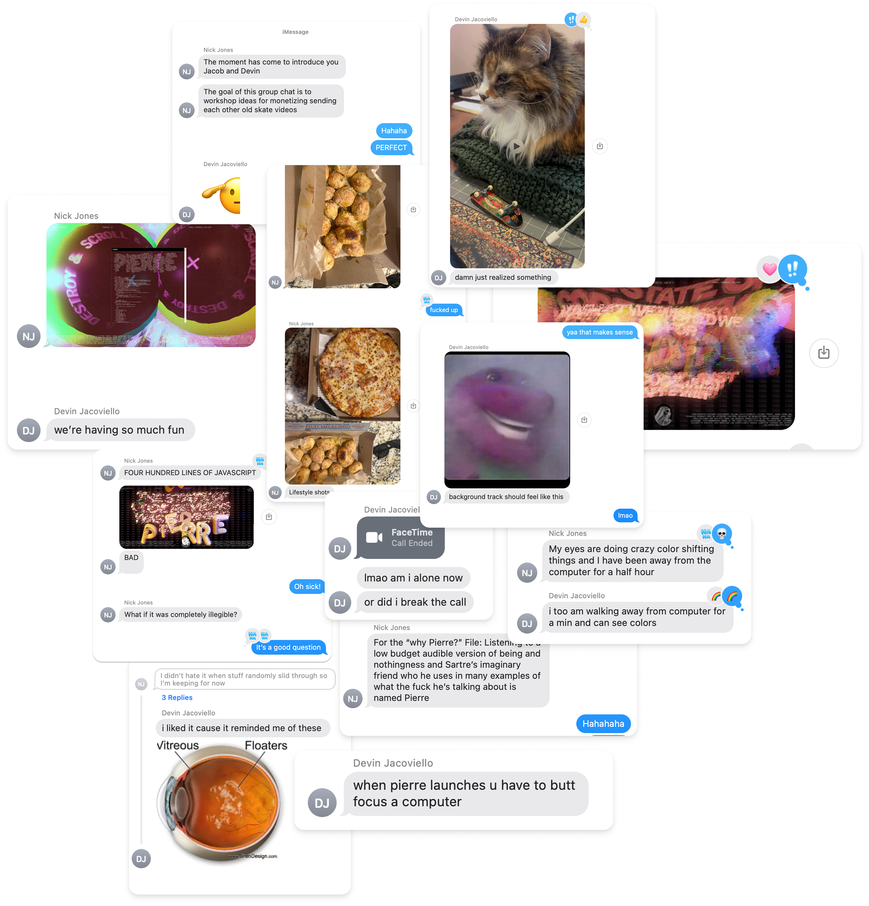
The iMessage thread is not an artifact, it's the process.
Nick and Devin "finished" the homepage ~2-3 weeks before launch. But it's never actually finished, which is the point. It's just unending layering of ideas until time runs out.
Some of my favorite parts (nicks audio, the flaming eye) we didn't come up with until much after we thought Nick and Devin were "done".
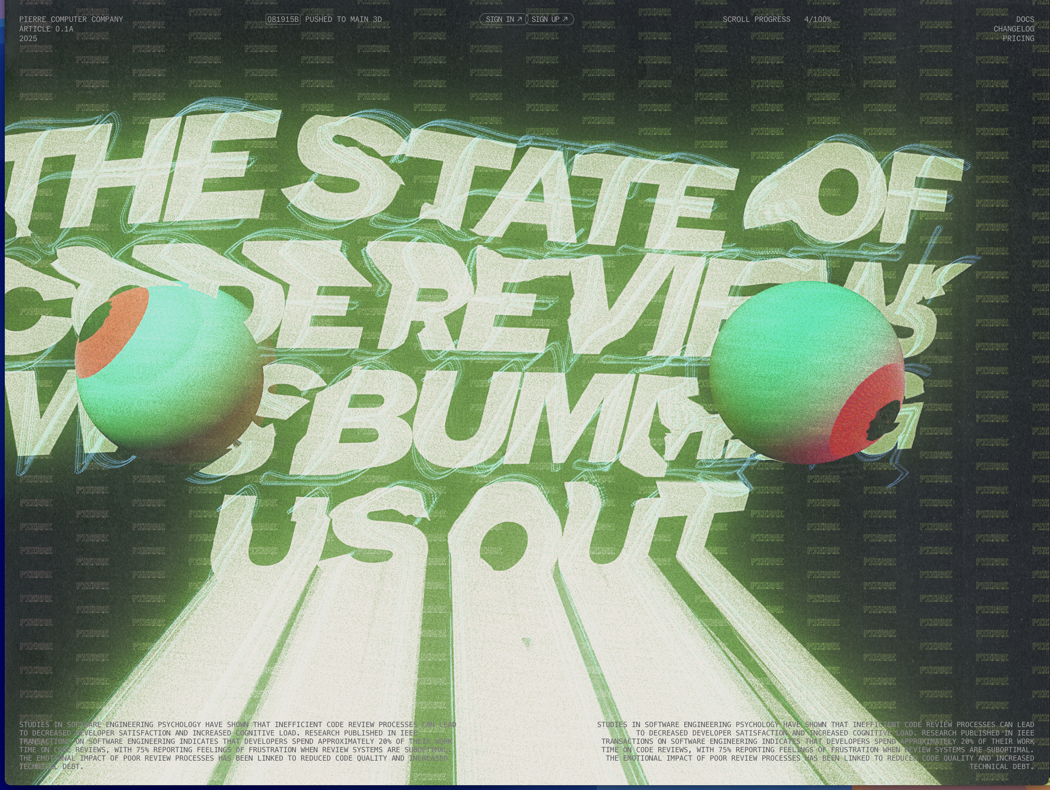
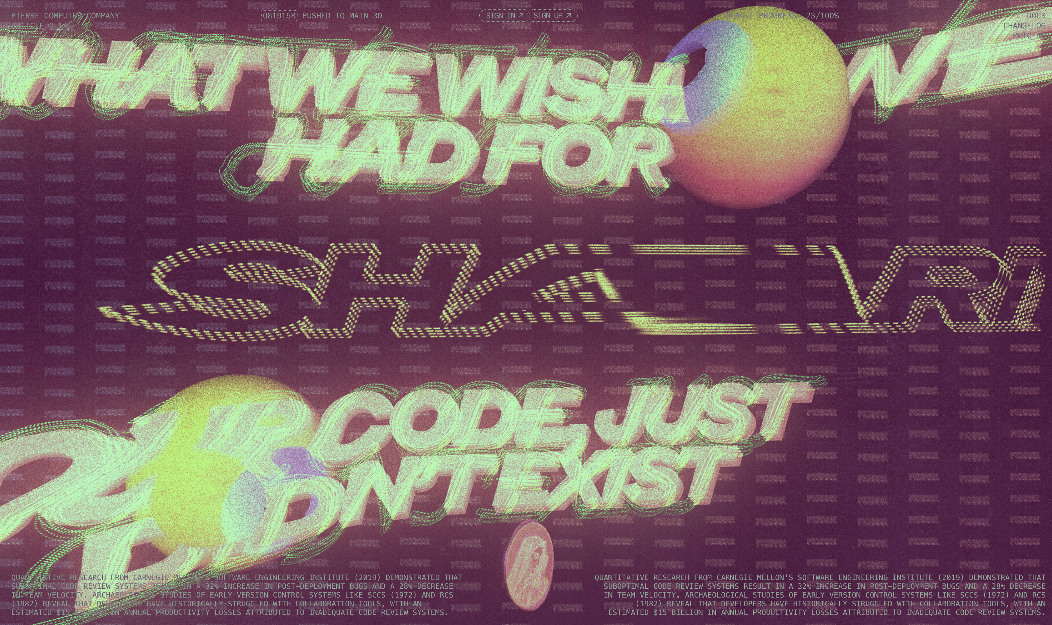
In the end, the homepage is a 90s homage to how we hoped software development would feel in the future – and a new version of extreme internet in an age of the same old same old that we're actually excited about. This is exactly what we hoped for and nothing that we expected.
Nick put more elequently: "This is a response to the samescape and a provocation. It relies on a shared language the 3 of us were able to speak and reference that wild time during the late 90s, when the web was new and untamed"
The end. Thank you for scrolling.
This page contains writing about Pierre's brand. If you would like to read it, click enter.
Load progress: 0/100%