Docs/CI
Gauges
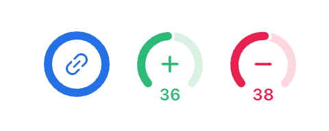
Gauges are top level visual indicators useful for calling attention to things like preview builds, performance metrics, bundle sizes, and more.
Example
Gauges appear in the top left corner of branches once setup.

Usage
import { Gauge, Icons } from 'pierre';

const gauge = new Gauge('Docs', {
  icon: Icons.Trash,
  color: 'red',
  description: 'How bad is jacob at writing docs?',
});

export default async () => {
  // run some numbers
  gauge.update({
    value: 0.9, // real bad
  });
};
Gauges require an “identifier string” and the following optional interface:
export default class Gauge {
	constructor(name: string, props: GaugeProps = {})
  …
}

export interface GaugeProps {
  // themeable color
  color?: Color;

  // visual icon
  icon?: Icons;

  // number value (between 0-1);
  value?: number;

  // small label shown beneath a gauge
  label?: string;

  // description shown on hover
  description?: string;

  // link to an external asset or preview
  href?: string;
}
Icon and colors come from the Pierre design system. While not open sourced, you can use any color or icon from the system by name. and see all available icons.
Joyful code review
Pierre wants you to enjoy code review with your team. So, we built a ~NEW~*~ Git platform to do just that.
We're in public beta! Join our Discord to share feedback and chat with the Pierre team.